Project Overview
Kaboo is a greeting card company that focuses on children’s mental wellness and communication between families who live far from each other (a different state or even a country).
As a startup company, Kaboo is hoping to attract new customers by guiding them to create an account and see the value of using Kaboo.
Before launching it’s first product, Kaboo needs help to improve user management and onboarding experience on desktop for three main user types: parent, child and family member.
Team of 3 UX/UI Designers: We executed all research, design and prototyping. My role was designing onboarding for a family member.
Role
Project Type
Contract
Contributions
Conducting Audit of an existing product, competitive analysis, creating user flows, designing wireframes and a high fidelity prototype.
Project Timeline
1 month
It’s challenging to keep in touch with families who live far away from each other.
It is time consuming to go through the whole experience sending a card by mail internationally.
Problem Space
To feel excited and engaged while using the product
To feel secure about Kaboo’s trustworthiness
To have an experience which requires a minimal effort to use the product
User Goals
Solution
The solution was to create onboarding for parents, children and family members from landing page to the dashboard. It was important to promote Kaboo values, showcase the friction-less, time saving and engaging experience for all user types.

Research
As a project of the team with three UX/UI designers it was important to distribute our responsibilities to make our 4-week project efficient.
Week 1: Research (Audit of existing product)
Our team conducted the audit of the existing design screens and color accessibility. We discussed all of our findings through Zoom meetings and then made a report of the colors that passed and didn’t pass the accessibility test.
Each of us decided to start working on a different user type and focusing on analysis of current design and features so we could identify pain points as well as areas for improvement.

This audit helped us determine which colors we can continue using from the previously proposed design from other candidate and which ones we should update in our upcoming high fidelity designs in order to improve accessibility.
Child’s POV
Parent’s POV
Family Member’s POV
Week 1: Research (Competitive analysis)
After we gathered all information from the existing product, we moved on to the competitive analysis in order to gain some insights about what onboarding experience other companies have for their users.
Each of us picked direct and indirect competitor companies. We analyzed their onboarding experience and got some inspiration of what could work for Kaboo’s target users.

Have simple and intuitive onboarding experience by using well-recognized patterns - option to continue with a Google, Facebook or Apple accounts.
Provide users with all necessary and easily discoverable information on their dashboard page: managing profiles, account settings, viewing cards, logging out.
Key Takeaways:

Key Takeaways:
Build clients’ trust by making a secure and trustworthy Sign Up/Log In experience with passwords, passcodes and security suggestions.
Focus on the first time users, encouraging them to join the platform by highlighting the CTA button.

Key Takeaways:
Save users’ time by checking to see if they already have an account before getting into the Signing Up process.
Simplify the Signing Up experience by not over filling with unnecessary additional information/details.
Design Process
Week 2: Creating User Flows
As a team of three UX/UI designers, we distributed each user type and started designing possible flows that would align with the company and user goals. As my focus was creating a family member’s experience when getting a physical card, I was aware of other teammates flows.
I did a regular check with them through a Zoom, Skype call or a Slack chat channel to make sure we help each other out with any questions, also to ensure that our flows and designs were matching.
Based on our discussion, presentation and evaluation with the stakeholder, we established our final ideas for possible user flows.
In order to create a new Kaboo account, parents would have three options: by signing up with Google, by signing up with Apple or by providing their email address. This variety would build the trust by giving users the control to decide. It would also save time for busy parents.
Flow 1
Parent’s Onboarding

Flow 2
Child’s Onboarding

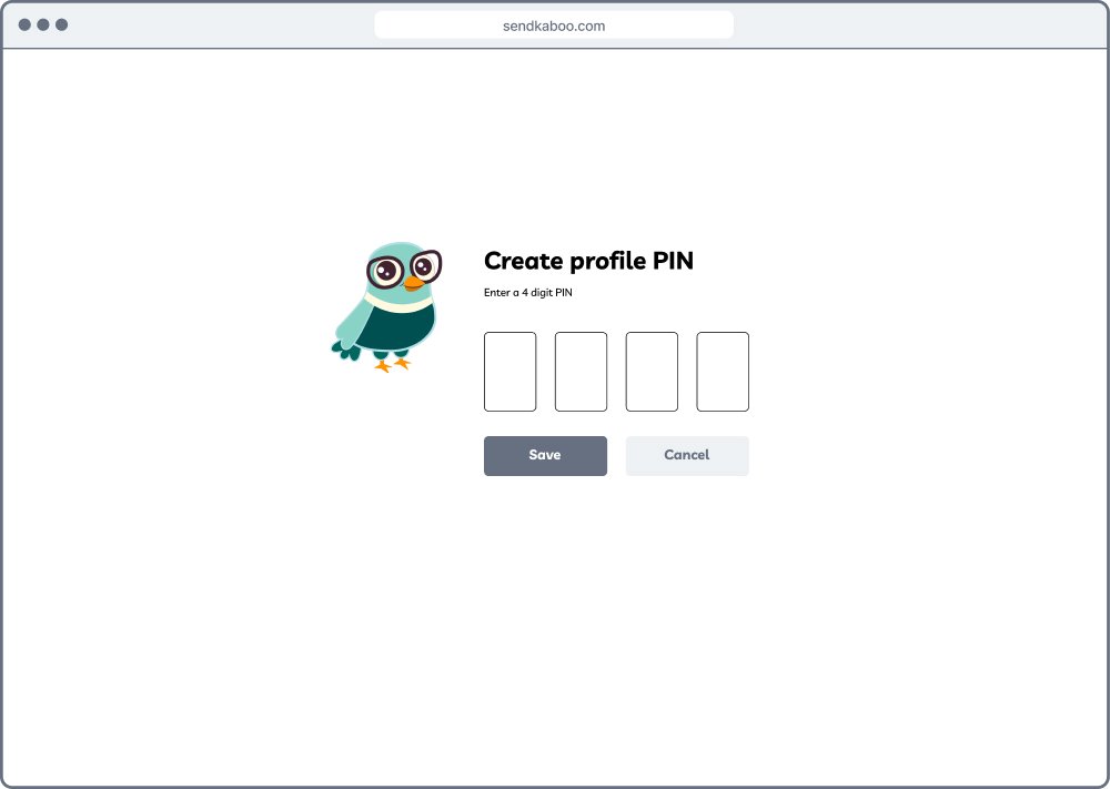
One of our suggestions was to simplify child’s flow and use Kaboo’s platform through the main (parent’s) account by only having a 4-digit passcode to access their profile.
The family would have only one account with different profiles and short privacy passcodes for each profile. It will help each family member have their own space, by allowing the parent to monitor and limit the amount of cards being sent by a child.
Flow 3
Family Member’s Onboarding

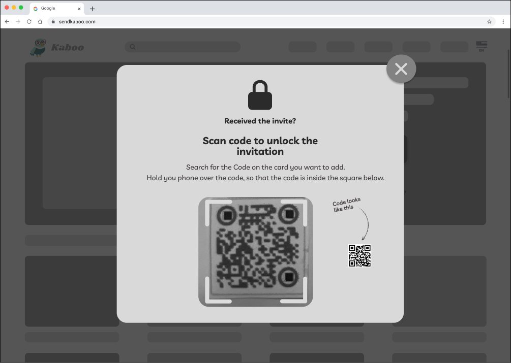
For convenience, building trust and edge cases, it was important to add two options for unlocking the card. One of them is manually entering the website into the search bar and another one is scanning the QR code provided on the card.
In order to secure sender’s information, Kaboo would require to enter the code which would be sent to receivers email address.
After entering received code, the card is unlocked. The family member can view it, create an account and enjoy all the benefits and values Kaboo has to offer.
Week 3: Designing Wireframes
At first, our designed wireframes had different visual style according to each designers individual taste and skills. Later we had a discussion where we thought of what elements to modify, include or eliminate for our final prototype in order to achieve a cohesive, clean and simple look.
We presented our high fidelity wireframes to the project’s stakeholder and, according to the feedback, we started working on the updates and other improvements.
Creating parent’s account experience


During the design process, we included few different elements to see how we could help users Create an Account or Log In in the informative, fast and intuitive way. We tried the progress bar, friendly reminders in a chat box, additional clarification questions.
We focused on creating a secure platform where each user could have their privacy. Meanwhile the account holder - a parent would be able to set a profile for their child and manage it whenever needed.
Child is being added to the account


Family member receives invitation to join the platform


One of the business objectives was to let potential users see the value of Kaboo early on so they could Sign Up and enjoy the experience. Kaboo is a gamified, interactive platform for kids and families, so I designed the screens where the card unlocks after scanning, receiver sees it come to life in an animated format.


For further interaction, a family member is able to choose if he/she would want to thank for the card right away or continue exploring the platform and reaching out to the sender later. This approach helps build trust by giving user the power to decide.
Having the business objective in mind, to reply or attach a media, a family member would have to create an account. In this way the user would be able to try the platform for some period of time first and get a feel of it.
Filling out receiver’s home address experience


I wanted to explore how a family member’s home address would be entered into Kaboo’s system. Initially, I thought of the standard filling out form since it’s familiar to everyone. The stakeholder did not align with this idea, since people are already annoyed by having to fill out long forms.
The client also mentioned that scanning the receiver’s or sender’s address might be easier so I decided to design both of these options. If the sender doesn’t know receiver’s home address, he/she could request it through email. In that case, receiver could choose between scanning it from an old envelope or adding it manually.
Email request to provide the home address


Although the address scanning idea is worth being considered, in terms of Kaboo’s future development, we decided to not continue exploring this option. It seemed too complex given the short period of time reserved for this project, and the stakeholder was doubting if Kaboo would want to have this part to be included in the onboarding experience.
Week 4: Designing High Fidelity Prototype
After validating our ideas, discussing possible solutions and design decisions with our team, we created our high fidelity screens for the final presentation to the stakeholder.
We focused on the main red routes to show the onboarding for new and existing users.
Red routes:
Log In experience for the parent
Adding and creating a new profile from the main account
Creating an account for the new member
Showing the card receivers experience

Landing page

Choosing a profile

Entering profile’s passcode

Adding a new profile - Choose avatar
Our team made sure that users’ onboarding is intuitive by creating flows that are recognizable and expected. We designed Kaboo screens in a way that is fun, inviting and positive for families looking to build strong relationships.
Trust and security was a very important aspect in our designs as well. This is the reason why features like - providing passcodes or giving users multiple options to choose from were included in our screens.

Managing profile

Card receiver’s experience - Security code
After the final high fidelity prototype presentation to the stakeholder, we received feedback with some changes to be made.
Before submitting our final designs and all other necessary files to the stakeholder, we updated some elements and areas where clarification was needed.
Because of the short period of time we weren’t able to test our high fidelity prototype with real users, but we prepared files in a way that would allow Kaboo to easily use it and test it in the future. After the iteration, we submitted all the deliverables and findings to the stakeholder. We are excited for Kaboo and wish them a successful launch.

Card receiver’s experience - Card is unlocked

Card receiver’s experience - Welcome splash screen
Outcomes & Lessons Learned
As the first project working with the client and a team, it was a great opportunity to face real problems and build an experience of working with the time limits and high expectations. During the 4-week period our team had regular weekly presentations and discussions with the stakeholder about our deliverables. The whole experience brought me a lot of valuable lessons together with some challenges.
Working in a team helped me hone my communication skills, time planning and work distribution. Being able to hear others’ insights about certain design elements, user flows, gave me an opportunity to look at the situation from different perspective. Ability to discuss different issues, unclarity or ideas with other designers helped us build a more insightful product.
Working with a startup company and product that hasn’t been launched yet was a very unique experience. I learned the importance of clarifying the hopes, goals and deliverables of the project from the early stage. Also, sticking to the project’s scope and timeline is crucial in order to meet expectations that were set from the beginning.
